Friday, February 28, 2014

Wisconsin’s Austerity Lesson

Popular Economics Weekly
Governor Scott Walker is having his own problems with the ongoing investigation into staffers using public funds for political campaigning as a County Manager, but it doesn’t seem to faze him as he touts the success of his austerity policies.
The only problem is that government austerity policies pushed through in 2010 when he was elected Wisconsin’s Governor (tax cuts plus lower government spending) don’t work. Especially during such difficult times as now when America still needs to recover from the Great Recession. It’s a lesson from the Great Depression that’s been forgotten, when President Roosevelt’s administration hired 8 million workers to build American public works projects from 1935-43 under the Workers Project Administration.
Almost every community in the United States had a new park, bridge or school constructed by WPA. The WPA's initial appropriation in 1935 was for $4.9 billion (about 6.7 percent of the 1935 GDP), and in total it spent $13.4 billion. Can we imagine what several $trillion in government spending would do today to boost economic growth, instead of the $831billion spent under the 2009 American Recovery and Reinvestment Act?
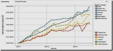
Wisconsin has gone in the other direction, depriving union workers in particular of incomes and jobs at a time when job creation should be Governor Walker’s priority. That’s why Wisconsin has fallen to the bottom of states in job creation, according to the Bureau of Labor Statistics.
Wisconsinjobs
Its beaten down public unions in particular are the poster children for what happens when governments take away workers’ ability to collective bargain, one of the most fundamental rights in any democratic society. The EPI Capital Times graph compares US job creation with national and other Midwestern states.
There is no other power to counteract the monopoly power of governments and private sector businesses. Under Wisconsin’s Act 10 enacted in 2010, which eliminated collective bargaining for most public workers, thousands of government workers have seen smaller paychecks as they are forced to pay more for health care and pensions.
And a new report from the Economic Policy Institute also blames the slow pace of the national recovery on cutbacks in the public sector. Unlike in previous recoveries, state and local government austerity has been a major drag on job growth and the broader economy. The number of public-sector jobs fell by almost 3 percent in the three years following the recession, while the number of private-sector jobs grew (albeit anemically). The fact that public-sector wages have lagged behind those in the private-sector exacerbates government’s drag on the economy, said the EPI report by Heidi Shierholz and Josh Bivens.
This is because austerity—cutting government workers’ wages and salaries in the name of reducing government spending—cuts the overall demand for goods and services. And since government doesn’t make things, decreasing their incomes decreases their ability to buy private sector goods and services, therefore cutting private sector jobs.
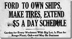
You would think small business people, as well as consumers, would understand this. It should be a no-brainer that even Henry Ford understood in 1914, when he upped his employees’ salaries to $5 per day so they could buy more of his Model Ts.
Ford-5
James Couzens, the Ford treasurer, said: “It is our belief that social justice begins at home. We want those who have helped us to produce this great institution and are helping to maintain it to share our prosperity. We want them to have present profits and future prospects. … Believing as we do, that a division of our earnings between capital and labor is unequal, we have sought a plan of relief suitable for our business.”
We are at a similar juncture in history today with record income inequality that has caused the middle class Henry Ford helped to create greatly lose its purchasing power. Who will help them to bring back a government and economy that works for all, which restores a more equal division of earnings and labor, one of our most fundamental rights?
Harlan Green © 2014
Follow Harlan Green on Twitter: https://twitter.com/HarlanGreen

Wednesday, February 26, 2014

January New-Home Sales Soar

Financial FAQs

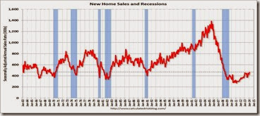
The Polar Vortexes haven’t stopped everything.  It looks like new-home sales are picking up in midwinter, a sign that existing-home inventories are too low. Sales of new single-family houses in January 2014 were at a seasonally adjusted annual rate of 468,000, according to estimates released jointly today by the U.S. Census Bureau and HUD. This is 9.6 percent above the revised December rate of 427,000 and is 2.2 percent above the January 2013 estimate of 458,000.

newsales

Graph: Calculated Risk

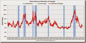
It was the highest sales rate since 2008, the end of the housing bubble. But inventories are still too low, which means new-home sales will continue to increase as more housing construction comes on line, with close to 1 million units already in the construction pipeline. The months of supply decreased in January to 4.7 months from 5.2 months in December.

existsupply

Graph: Calculated Risk

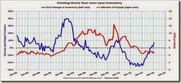
The problem is obvious from this graph. Inventories have returned to levels that prevailed from 1997 to 2005, a prolonged period of pent up demand for housing that, along with prolonged easy credit conditions, caused the housing bubble.

January's data show a big 10.4 percent gain in the South which is by far the largest region for new home sales. The West, which is a distant second behind the South, shows an 11.0 percent gain.

A plus for sales has been recent price concessions as the median price is down 2.2 percent to $260,100. The year-on-year sales gain, which spent most of last year in the double digits, is now modest, at 3.4 percent and in line with the 2.2 year-on-year gain for sales.

This is while total existing-home sales, which are completed transactions that include single-family homes, townhomes, condominiums and co-ops, dropped 5.1 percent to a seasonally adjusted annual rate of 4.62 million in January from 4.87 million in December, and are 5.1 percent below the 4.87 million-unit pace in January 2013.

So new-home sales are surging, and will continue to surge, as long as existing inventories are so low. Last month’s existing-home activity was the slowest since July 2012, when it stood at 4.59 million, and signals the effect of low inventories and rising interest rates that have cut mortgage applications to their lowest level in a year.

Harlan Green © 2014

Follow Harlan Green on Twitter: https://twitter.com/HarlanGreen

Tuesday, February 25, 2014

Existing-Home Sales Slow in January

The Mortgage Corner

Total existing-home sales, which are completed transactions that include single-family homes, townhomes, condominiums and co-ops, dropped 5.1 percent to a seasonally adjusted annual rate of 4.62 million in January from 4.87 million in December, and are 5.1 percent below the 4.87 million-unit pace in January 2013.

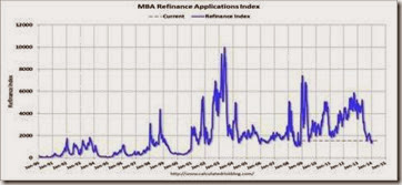
Last month’s level of activity was the slowest since July 2012, when it stood at 4.59 million, and signals the effect of low inventories and rising interest rates that have cut mortgage applications to their lowest level in a year.

Total housing inventory at the end of January rose 2.2 percent to 1.90 million existing homes available for sale, which represents a 4.9-month supply at the current sales pace, up from 4.6 months in December. Unsold inventory is 7.3 percent above a year ago, when there was a 4.4-month supply.  But both rates are far below the  6-month inventory level in more normal times.

existhome

Graph: Calculated Risk

Meanwhile, mortgage applications are down for the year.  The MBA’s weekly mortgage applications refinance survey is down 70 percent since May, and its purchase index is down 8 percent in a year.

MBAapplics

Graph: Calculated Risk

This is even though 30-year fixed conforming rates are down to 4.0 percent since the latest signs of slowing factory activity and job creation over the past 2 months.

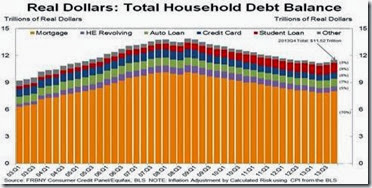
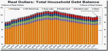
But the slowdown may be temporary, as the NY Fed’s just released Q4 Household Debt and Credit Report said consumers are paying down their debts while spending more.  The report showed that total household debt is 9.1 percent below the Q3 2008 peak. Mortgage debt is down 13.4 percent from the peak, and Home Equity revolving debt is down 25.9 percent.

householddebt

Calculated Risk

Does this mean the household deleveraging of debt that has held down consumer spending since the Great Recession is over?  Are consumers opening up their wallets finally, and will this boost 2014 housing sales? 

We believe so, because of the tremendous pent up demand generated by 5 years of subpar housing construction that has reduced inventories, much lower delinquency rates, and a growing population that is boosting housing demand.

Harlan Green © 2014

Follow Harlan Green on Twitter: https://twitter.com/HarlanGreen

Friday, February 21, 2014

Consumer Debts Returning to ‘Normal’

Popular Economics Weekly

The NY Fed released their 2013 Q4 Household Debt and Credit Report. The report showed that total household debt is 9.1 percent below the Q3 2008 peak. Mortgage debt is down 13.4 percent from the peak, and Home Equity revolving debt is down 25.9 percent.

This is even though aggregate consumer debt increased by $241 billion in the fourth quarter, the largest quarter-to-quarter increase since 2007, said the NY Fed report. More importantly, between 2012:Q4 and 2013:Q4, total household debt rose $180 billion, marking the first four-quarter increase in outstanding debt since 2008.

condebt

Calculated Risk

Does this mean the household deleveraging of debt that has held down consumer spending since the Great Recession is over? Are consumers opening up their wallets finally, and will this drive increased consumer spending and so GDP growth this year?

Barron’s Gene Epstein and Applied Global Macro Research (AGMR) economists believe so. AGMR projects 4 percent in economic output this year and next, arguing that future demand for housing will also boost consumer spending by creating jobs in the many ancillary industries that service housing. This is far above the Fed’s FOMC prediction of 2.8 to 3.4 percent GDP growth through 2015. It also means unemployment has to fall below 6 percent, and the Fed will begin to raise their overnight rate to 0.25 percent from its current 0 percent.

But AGMR’s report doesn’t take into account the sharp decline in federal and local government spending, which has been a drag on growth since 2009. It would have to pick up as well, in my opinion. This is happening in states like California, whose budget is now in surplus, but not at the federal level, in spite of the $1.1 trillion budget agreement for the rest of this fiscal year.

As net household borrowing resumes, it is interesting to see who is driving these balance changes, and to compare some of today’s patterns with those of the boom period. This will help to determine how sustainable is such consumer spending, and so economic growth and job creation.

Auto and student loans have led the way and been growing for some time, while overall debt continued to fall. But in 2013, the increased credit card and mortgage debt among the young and the riskless has led to a turnaround in the trajectory of overall debt. This was the case in the comparison in debt with 2005, and is still the case today. It is the under 30-year olds that are borrowing and spending the most.


blog_charts_template

Graph: NY Federal Reserve

And we believe it is the below-30 cohort that will comprise most of the increased demand for housing, as household formation is predicted to pick up above 1 million per year for the rest of this decade, according to the 2013 Harvard Joint Center for Housing Studies’ State of the Nation’s Housing report.

“With rising home prices helping to revive household balance sheets and expanding residential construction adding to job growth, the housing sector is finally providing a much needed boost to the economy,” says Eric S. Belsky, Managing Director of the Joint Center for Housing Studies. “But long-term vacancies are at elevated levels in a number of places, millions of owners are still struggling to make their mortgage payments, and credit conditions for homebuyers remain extremely tight.”

So as always, the key will be pent-up demand for housing and consumer goods that has been constrained since 2009, due mainly to the mountain of debt that has now been reduced to more manageable levels. But government has to be included in any growth projections, and any boost in government spending is still in question.

Harlan Green © 2014

Follow Harlan Green on Twitter: https://twitter.com/HarlanGreen

Tuesday, February 18, 2014

Hoorays For New Fed Chair Janet Yellen

Financial FAQs

Fed Chairwoman Janet Yellen’s congressional testimony proved that she is more than qualified to steer the US economy back to health. She is the economists’ economist, in a word, willing to explain the most basic economic truths in her first marathon session (7 hours) in front of the House Committee on Financial Services.

For instance, when asked why did we need QE3 purchase of securities, she responded that the Fed had taken seriously Congress’s twin mandates of maximum employment with stable inflation. And since inflation was in fact still falling (far below what is normal for healthy growth) and employment weak, keeping interest rates as low as possible at this stage of the recovery was the best way to boost the continued growth of jobs.

She also said the Fed would continue to taper their monthly QE3 purchases. But stocks and bonds rallied this time, rather than fell as in the past on the fear that higher rates might stifle growth. The markets took her remarks instead as a sign that economic growth was strong enough to be able to accommodate higher interest rates.

But her testimony was most important, because she instilled confidence that she knew what she was talking about. She was the Vice-Chairman that had created the current Fed policies with former Chairman Bernanke, after all.

 JOLTS

Graph: Calculated Risk

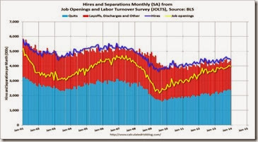
The best indicator re job creation is the Labor Department’s JOLTS report that tracks the number of ‘quits’, those that voluntarily leave their jobs because of better prospects. Therefore, the quits rate can serve as a measure of workers’ willingness or ability to leave jobs. The number of quits (not seasonally adjusted) increased over the 12 months ending in December for total nonfarm and total private and was little changed for government.

The above graph, compliments of Calculated Risk, shows job openings (yellow line), hires (dark blue), Layoff, Discharges and other (red column), and Quits (light blue column) from the JOLTS.

Notice how the yellow line of job openings has been rising since 2009, the end of the Great Recession. Hires (dark blue) and total separations (red and light blue columns stacked) are pretty close each month. This is a measure of turnover.  When the blue line is above the two stacked columns, the economy is adding net jobs - when it is below the columns, the economy is losing jobs.

Jobs openings decreased slightly in December to 3.990 million from 4.033 million in November. But the number of job openings (yellow) is up 10.5 per openings year-over-year compared to December 2012, and almost double 2009 2.2 million openings, while quits increased in December and are up about 12 percent year-over-year.

This is the employment picture Fed Governors are seeing, and the reason there is still a long way to go to achieve full employment. After all, there were more than 5 million job openings in 2000 alone, and 22 million jobs created from 1992 to 2000. That was a different era, but one that the Federal Reserve is mandated to recreate.

Harlan Green © 2014

Follow Harlan Green on Twitter: https://twitter.com/HarlanGreen

Tuesday, February 11, 2014

Housing Inventories Continue Increase

The Mortgage Corner

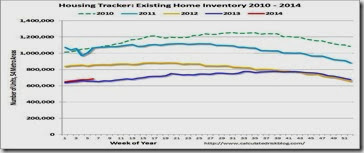
Calculated Risk and Housing Tracker report that existing-home for sale inventories have increased 4.7 percent in February. It is good news for those who worry that the lack of inventory will hold back existing-home sales this year.

inventories

Graph: Calculated Risk

The red line denotes 2014 inventory from Housing Tracker’s Department of Numbers. California cities led the increases, with San Francisco inventory up 7.1 percent, San Jose + 8.6 percent, and Sacramento + 8.8 percent. And as of February 10, San Francisco had the highest weekly price increase of 4.9 percent. Thank you, Silicon Valley, as such high-tech startups as Twitter are headquartered in San Francisco.

This should mean price increases will slow, however, as more supply comes on the market, and default ratios continue to decline. The median asking price for homes in the US peaked in June 2006 at $319,459 and is now 21.1 percent lower. From a low of $211,844 in January 2011, the median asking price in the US has increased by $40,327 (19.0 percent), says Housing Tracker.

Tracking total distressed sales is the best way to determine how quickly housing is recovering from the Great Recession. And California’s distressed sales have dropped sharply in a year, down to 22.2 percent of sales in December 2013, vs. 42.5 percent in December 2013, according to Calculated Risk. Sacramento, noted for overbuilding even in good years, had the sharpest drop with total distressed sales down to 22.2 percent of sales in Dec. 2013, vs. 51.5 percent in December 2012.

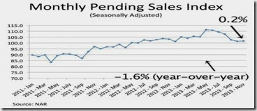
However, the NAR’s Pending Home Sales Index, a forward-looking indicator based on contract signings, fell 8.7 percent to 92.4 in December from a downwardly revised 101.2 in November, and is 8.8 percent below December 2012, as we said last week. The data reflect contracts but not closings, and are at the lowest level since October 2011, when the index was 92.2.

pendingsales

Graph: NAR

But we believe with the percentage of conventional (vs. distressed) sales’ inventories increasing, existing-home sales will pick up in 2014. And if not, then new-home sales will take up the supply slack, with new-home building permits issued increasing close to 1 million annually.

Sales of newly built, single-family homes fell 7 percent to a seasonally adjusted annual rate of 414,000 units in December, according to newly released figures from the U.S. Department of Housing and Urban Development and the U.S. Census Bureau. Despite the monthly drop, home sales in 2013 were up 16.4 percent over the previous year. But several factors seem to be slowing down new-home sales.

Harlan Green © 2014

Follow Harlan Green on Twitter: https://twitter.com/HarlanGreen

Monday, February 10, 2014

Weak Employment--American Austerity at Work

Popular Economics Weekly

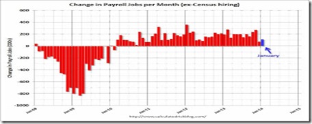
Is economic growth grinding to a halt, even as pundits predicted better growth in 2014? Nonfarm payrolls have advanced just 188,000 over the past 2 months, when this was the average montly increase in prior months. It does look like economic growth is slowing.

As in Europe, the U.S. is seeing the results of 4 years of austerity policies in the January unemployment report. Total nonfarm payroll employment rose by just 113,000 nonfarm payroll jobs in January, instead of the 180-200,000 predicted by the pundits, and the unemployment rate was little changed at 6.6 percent, the U.S. Bureau of Labor Statistics reported today.

This follows the change in total nonfarm payroll employment for November, revised from +241,000 to +274,000, and the change for December was revised from +74,000 to +75,000. With these revisions, employment gains in November and December were 34,000 higher than previously reported. This is not a good report, needless to say.

jobs2014

Graph: Calculated Risk

So what could have been with the initial $831 billion American Recovery and Reinvestment Act that stopped the Great Recession from becoming another Great Depression, ended when government gridlock set in after the 2010 election. The banks were saved with GW Bush’s $300 billion in TARP spending, but Main Street was left to fend for itself. Instead of more government stimulus, government spending was drastically cut when it came to stimulating job growth outside of Wall Street and the financial sector.

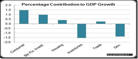
Instead, government employment in particular sank, losing some 700,000 jobs. And because so much government spending was cut, what followed was the most severe contraction in spending and investment since the 1930s.

The lessons from the New Deal was lost. When private investment and employment shrink, it’s up to governments to spend more to create those jobs and public projects that employment the unemployed, as was done in the 1930s with the Works Progress Administration and CCC Corps.

GDP

Graph: Econoday

Almost every community in the United States had a new park, bridge or school constructed by WPA. The WPA's initial appropriation in 1935 was for $4.9 billion (about 6.7 percent of the 1935 GDP), and in total it spent $13.4 billion. Between 1935 and 1943, the WPA provided almost eight million jobs.

The 6.7 percent of today’s GDP would equal some $1 trillion, and it doesn’t take much to imagine what 8 million additional jobs would do to stimulate growth today, instead of the 700,000 government, or government-financed jobs lost.

During the course of the Great Recession, about 7.5 million jobs were lost in the nonfarm business sector. Job losses did not end until February 2010, by which point total jobs lost stood at about 8.7 million. Since then and after four years of growth in the aggregate economy, employment recovered by some 6 million, still short of the sharp decline we experienced.

Debt never become a problem, even with WWII, because the additional growth that such programs stimulated more than paid down that debt. The preoccupation with debt that occurred after 2010 was because those Republicans and conservative Democrats that helped GW Bush to create the huge deficits during his 8-year term would no longer support such spending. They now opposed anything that smacked of government aid.

The unemployed were suddenly lazy bums, and it was the middle class who foolishly created the housing bubble by buying homes with overinflated prices. (So they now had to pay the piper.)

It’s that kind of attitude that creates gridlock, of course. This is not how to recover an economy—especially when everyone but the top 1 percent has to pay the piper.

Harlan Green © 2014

Follow Harlan Green on Twitter: https://twitter.com/HarlanGreen